Think back to the last company website you visited… Can you recall any details about it besides what it was selling? Was it bright or dark? Did it have more text or visual elements? How was the information organized? If you’re having trouble remembering details like these, the site probably didn’t leave a lasting impression on you.
Many times, consumers look at websites as a way to judge a company they’re considering working with or buying from. Because of this, it’s important that your website provides a virtual experience that is similar to the one people would get when they walk into your office. Thinking this way will allow you to use your site as an additional tool in maintaining a healthy brand image.
If your site isn’t performing like you want it to, don’t be discouraged! We’ve got just the tips you need to help “wake it up” and maximize its potential. The following website characteristics have proved most appealing among various types of consumers:
- Solid Structure – The OCD in all of us cries out for this. Inside every human is a need for order and organization, so it’s not surprising that consumers find these things appealing in websites. To create a solid structure for your site, it must be clean and easy to navigate. This means it should display some kind of repetition or common theme, while also living up to the Geico philosophy of being “so easy a caveman could [use] it.”
-
Gradients – They’re back and better than ever! Comebacks are everywhere these days. Fashion, music, film… so why not the web? Gradients have been welcomed back with open arms by large brand names from all sorts of industries.

Hop on the bandwagon and incorporate gradients into your site somewhere. But first, make sure you’re aware of how consumers are going to respond to the colors in your gradient. If you haven’t already, do some quick research on color psychology. Check out our post on “How Colors Can Influence Your Buyers” for more information on invoking certain emotions in consumers.
- Big & Bold – More and more, we’re seeing big, bold sites that aren’t afraid to take risks and be different. It’s not a coincidence that these sites are the same ones that are generating a lot of traffic and holding consumers’ attention. Large block images, bold headers, and bright colors (to name a few) can add energy and confidence to a site that was otherwise nothing more than a standard, text-filled template.

-
Relaxed Tone – When writing the copy for your site, try using a soft sell approach. Consumers today have little tolerance for hard sell (or direct) marketing techniques and are more interested in buying if they think it was their idea. Write to your audience as a friend with a great recommendation, rather than a salesperson concerned with increasing profits.
If you’re dead-set on staying as professional as possible in your site’s main copy, try adding a link to an “about our company” page. Providing a few brief paragraphs about your company’s mission and how it came to be will give consumers the opportunity to connect with your business on a more personal level. Remember to keep a relaxed tone while writing this page, and don’t be afraid to get a little silly! Check out Saddleback Leather’s Story for inspiration.
- Opportunities for Interaction – One of the main reasons for building a website is to give consumers a chance to easily and conveniently interact with your brand. If you’d like to see more consumer-interaction on your site, try adding one or more of the following things: call-to-action buttons or links (make ‘em big and make ‘em bright), featured videos, subscription pop-ups, polls or surveys, comment sections, moving portfolio (check out Apple or Dyson to see this feature in action), and tons more. Tools like these can really help reinvent a website by allowing the consumer to get as involved with the brand as he or she wants, without the pressure of talking to someone directly.
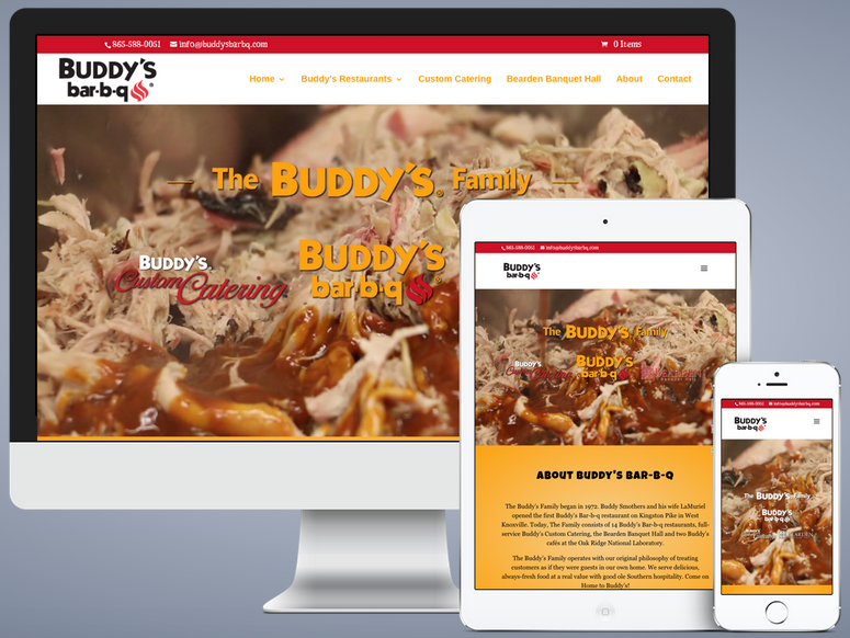
- Making It Mobile – This recent website trend is changing the way we do business… but we’re not complaining. The popular shift in content accessibility has undeniable benefits for today’s businesses. According to comScore, 60{a2396c2253210e4fe96a9350db4998fead2ccefaff88800abc5f9217fb562a1a} of all internet traffic comes from phones and tablets. Don’t believe it? Just go to your favorite local spot and look around you. The number of people you see on their phones may surprise you. Need some extra help making your site mobile? No problem! Tune in next week where we’ll be taking a deeper look at Mobile Websites.
Thanks for reading about the many different ways you can “wake up” your website! If you enjoyed this post, feel free to share it with your friends or follow us on social media for more like it!
—Amanda Myers, Marketing Intern at BoydTech Design, Inc.