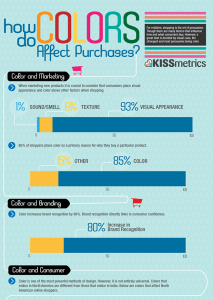
 It is a complicated process. We hang a color wheel on a dartboard, take three shots, and voila, there’s your new theme. I’m kidding of course. There’s a lot behind a color. A color can push someone’s buttons, and derive an emotion that can influence the way they purchase, or how much time they spend reading your content or advertisement. Scientists have been good to designers and marketers by proving the theory that colors trigger certain responses in the brain. As a matter of fact, 93{a2396c2253210e4fe96a9350db4998fead2ccefaff88800abc5f9217fb562a1a} of buyers pick an item over another by its visual appearance. Oddly enough, the triggers colors effect can differ from one country or geographic region, to another. Here are some examples of what North American shoppers perceive:
Yellow: Optimistic and youthful. Yellow is often used to grab the attention of window shoppers or specials on an online store.
Red: Energy. Red increases the heart rate and creates a sense of urgency. You’ll notice most clearance or sale items utilize red in some fashion.
Blue: Creates the feeling of trust and security. Businesses and banks use blues to make you feel more comfortable working with them.
Green: An obvious trait to people in the United States, green is associated with wealth. It’s also the easiest color for the eyes to process so it creates a relaxed feeling. Greens are used a lot in stores and places that want to make you feel welcome.
Orange: Not only does orange make you (or just me) think of Halloween, but it is also an aggressive color. Orange creates a call to action. You’ll see it frequently on subscribe, buy or sell buttons online. Ever noticed the color of PayPal buttons?
Pink: Romantic and feminine. Pink is the perfect color to use if your audience consists of women and young girls.
Black: Blacks are powerful, and sleek. They trigger refinement and luxury. Blacks are typically used to market luxury or high end products. When you think of riding in a limo, don’t you automatically picture it black?
Purple: Purple is a soothing and calming color. Next time you’re in a department or drug store, walk by the beauty or anti-aging products and take note of a predominant amount of purple.
Click here to download a pdf with more color details.

Trackbacks/Pingbacks