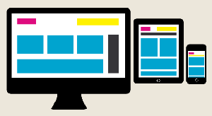
 The problem is that a website that looks great on a desktop might not look so great on a phone. In the past it was common to see sites employ a mobile version. You may have noticed that when you visit sites from your phone you’ll see a “moble.domain.com” or “m.domain.com” address with an option to “View the full site” at the bottom. This was a great way to deliver mobile-friendly content to your customers… at least until we got tablets, huge smart phones, xboxes, internet TVs and countless other devices.
Technology always changes and today we have an even better way to deliver content to your customers. The practice is know as Responsive Design. In this article we’ll cover what responsive design is and how it affects your business.
Responsive design is a method web designers can use to display your website differently on multiple devices. Instead of trying to pick a design for each individual type of device and have a separate site for it, we can select a design based on the width of the device’s screen. You can even adjust the size of a typical browser on your computer and watch your site transform into a “skinny” version right before your eyes.
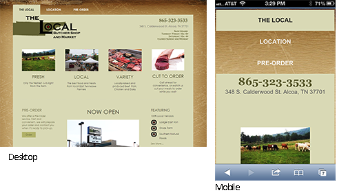
Here are some screen shots of www.localbutchertn.com. The Local’s site changes shape when viewed on an iphone. All the photos and information is available on both full screen and mobile versions. Notice how important information such as the phone number and address are prominently displayed. Try it out on your own devices to see the difference.

Reasons for Implementing Responsive Website
Let’s look at some of the reasons for implementing a responsive website.
Reaching Your Customers
Take a look around next time you’re out in public, how many people have a phone in their hand? When we get an idea or think of a product we reach for that device in our pocket, we don’t wait until we get home to look it up on our computers. As a company you need to be accessible to this growing segment of your customers. There are about 3 billion smartphone users in the world, at least 44{a2396c2253210e4fe96a9350db4998fead2ccefaff88800abc5f9217fb562a1a} of those access the internet via their phone.
Your customers are already on mobile
Check analytics for your site, you can tell how many visitors you are getting from mobile and tablet devices. Are you serving good content to these folks?
Maintenance Cost
Although there are typically upfront fees to switching to a responsive design, you no longer have to support multiple different websites, one for each device. Anytime you make an update to your website, it will automatically work for all devices.
Avoiding duplicate or conflicting content
With 2 or more sites you run the risk of creating content that is different. At best this will confuse your customer, at worst it gives them inaccurate information.
Custom Content Removal
As your site gets “smaller” some items, especially extra graphics, ads, or text that is nice on a large screen can be removed on smaller screens. Just your most important content is displayed on the smaller device. People using phones need to get to your information much faster, as they are likely on-the-go.
Good for SEO
Part of Google’s rankings include logic to deliver the best content to searchers. If a user is searching on a mobile device Google has stated that it ranks mobile friendly sites higher for those users. If you have a site that is not-mobile friendly, looks poor on mobile, or 2 sites that are different you will encourage users to find another site. 61{a2396c2253210e4fe96a9350db4998fead2ccefaff88800abc5f9217fb562a1a} of visitors will search Google again for a better site than yours. This increases your bounce rate and in turn lowers your search ranking.
Early Adoption
Right now Responsive design is a relatively new topic. Most sites don’t employ it. There is an opportunity to stand out from your competitors by delivering a website that is optimized for their viewing experience. Sooner or later everyone will do this, but if you do it now, you’ll be a step ahead and look that much better than the competition.
Just a few notes on the downsides… yup there is always a catch, right?
Time and cost
Chances are good you have a website and you like it. Switching to a responsive site will involve time and cost. It all depends on how complex your site is, and when it was originally built. Newer sites may already have many responsive features built-in. Contact your web provider and ask how complicated it would be to update your site. For example, most of our sites are either responsive already, or pretty darn close, so it’s likely not a bank-breaking deal to update them.
Large Sites vs. Small sites.
If you have a site that is just chock full of information it might not work well in a responsive layout, there’s just too much information to try to download to a poor little phone on 3G or (god forbid… the Edge). Very large data-intensive sites may still have to rely on mobile versions or even custom apple/android apps to achieve a good experience for customers. These might include news sites.
Sites that rely on 3rd party apps.
Many CMS sites use 3rd party extensions, these extra pieces of code typically perform some function on your site such as e commerce, calendaring or image display. If you have an extension that itself is not responsive, you may need to find a new solution or wait until that extension is updated.
Mobile experience
Depending on your design your existing site might rely heavily on many menus, small links to click on, or require lots of data entry. These types of things are not easy to do on a phone. You might need to consider how your desktop version can be modified to be more mobile-friendly. remember your desktop customers and mobile customers will now see the same pages.
How to get started with a responsive website
Your best bet (after you’ve read this article of course) is to talk to your web designer. They can help you determine if your site should be updated and how easy it would be to do so.
Take a look at your metrics. Are your customers viewing your site from their mobile devices? If so call that web designer soon. If not you might be able to hold off… or maybe it means you are missing out on some customers!
You can also start piece by piece. Doing things like optimizing image size, reducing clutter and making important text or buttons easy to click on can make even a non-responsive design work better on a phone.
Each company will be a bit different and you’ll have to weigh the benefits vs. the time and cost of a site update. As I like to tell our customers treat your website as part of your overall marketing and customer relationship plan. Make your decisions based on facts and metrics.
